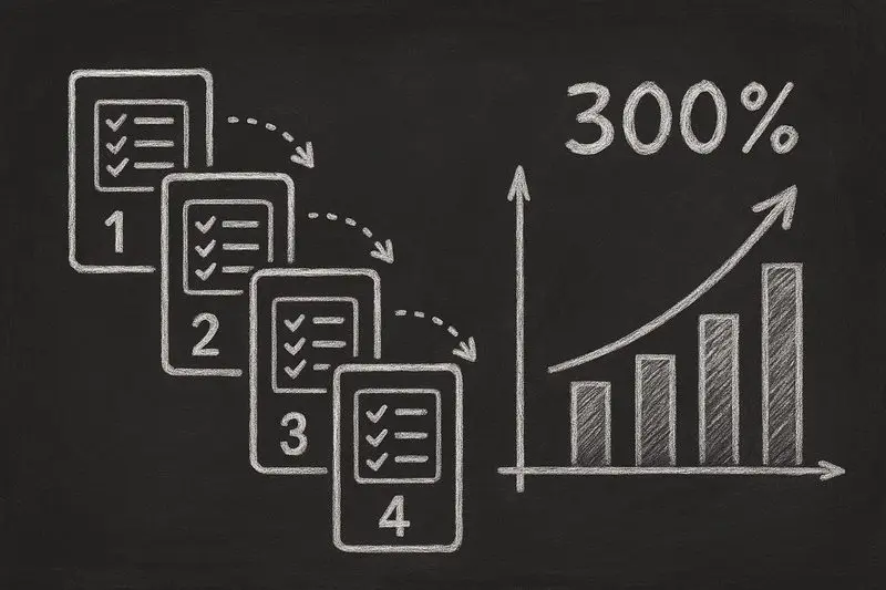
Multi-step forms convert 300% better than single-step forms on average — but the actual lift depends heavily on field count, industry, and how you split the steps. The 67% abandonment rate on long single-step forms is real, and so are the documented case studies from Formstack, HubSpot, and others where breaking a 12-field form into 4 steps doubled or tripled completions.
Below: the actual conversion-rate statistics with named sources, the cognitive psychology behind why splitting works, and a step-by-step playbook to build a multi-step form in any builder — including the 3 most common mistakes that kill the lift.
The Data: Multi-Step Forms vs Single-Step Forms
Let's look at what the numbers actually show:
Multi-Step vs Single-Step Form Performance
| Metric | Single-Step Forms | Multi-Step Forms | Improvement |
|---|---|---|---|
| Average Conversion Rate | 3-5% | 12-20% | +300% average |
| Form Abandonment Rate | 67-75% | 25-40% | -40% abandonment |
| Average Completion Time | Varies (often abandoned) | 2-4 minutes | Higher engagement |
| Lead Quality Score | Low (minimal data) | High (progressive profiling) | Better qualification |
| Mobile Completion Rate | 15-25% | 45-65% | +180% on mobile |
A landmark study by Conversion Fanatics found that converting a single-step form into a multi-step form increased conversions by 59.2%. Just Eat reported that implementing one-question-per-page generated an extra 2 million orders per year.
Research from Seckler et al. (published at CHI 2014) showed that forms following usability best practices achieved 78% one-try submissions, compared to only 42% for poorly designed forms — nearly double the success rate.
The Psychology: Why Multi-Step Forms Convert Better
Multi-step forms don't just look better — they exploit five powerful psychological principles that make people more likely to complete them.
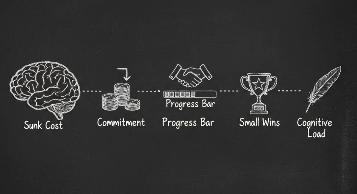
1. Reduced Cognitive Load
The human brain has limited processing capacity. When a user sees a form with 15 fields, their brain immediately calculates the effort required — and most decide it's not worth it. Multi-step forms show only 2-3 fields at a time, making each step feel effortless.
2. The Commitment and Consistency Principle
Once someone completes Step 1, they've made a micro-commitment. Robert Cialdini's research on influence shows that people who take a small initial action are far more likely to continue with larger actions to remain consistent with their self-image as someone who follows through.
3. The Sunk Cost Effect
After investing time in Steps 1 and 2, users are reluctant to abandon their progress. The further they advance, the more they feel compelled to complete the form — their prior effort becomes a powerful motivator to continue.
4. Progress Motivation (The Endowed Progress Effect)
Research from the University of Nebraska-Lincoln found that users shown animated progress bars demonstrated 3x greater willingness to wait than those with no progress indicator. When people can see how far they've come and how little remains, completion rates surge.
5. Chunking (Miller's Law)
George Miller's foundational cognitive psychology research established that humans process information best in chunks of 5-9 items. Multi-step forms naturally chunk your questions into digestible groups, aligning with how the brain actually works.
The Anatomy of a High-Converting Multi-Step Form
Not all multi-step forms are created equal. Here's what separates the top performers from the rest.
Optimal Step Count
Recommended Steps by Form Type
| Form Type | Optimal Steps | Fields Per Step | Best For |
|---|---|---|---|
| Lead Capture | 2-3 steps | 2-3 fields | Newsletter signups, gated content |
| Contact/Inquiry | 3-4 steps | 2-4 fields | Service businesses, B2B inquiries |
| Consultation Booking | 4-5 steps | 2-3 fields | Medical, legal, financial services |
| Product Recommendation | 5-7 steps | 1-2 fields | E-commerce, quiz-style forms |
| Application/Onboarding | 5-8 steps | 3-5 fields | SaaS onboarding, job applications |
Progress Indicators That Work
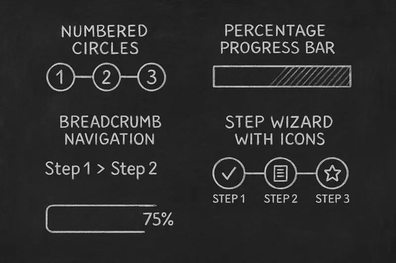
The best progress indicators share three qualities:
They show current position (Step 2 of 4). They indicate remaining effort (just 2 steps left). They provide visual momentum (completed steps are visually distinct from remaining ones).
Nielsen Norman Group's research is clear: display contextual text explaining what's being processed, start progress conservatively and accelerate toward completion, and provide generous time estimates to avoid disappointing users.
Question Ordering Strategy
The order of your questions directly impacts completion rates:
Multi-Step Form Question Ordering Strategy
| Step | What to Ask | Why |
|---|---|---|
| Step 1 | Easy, low-friction questions (name, what brings you here) | Builds commitment with minimal effort |
| Step 2 | Qualifying questions (budget, timeline, company size) | Already committed, more willing to share |
| Step 3 | Specific needs/preferences | Investment increases willingness to provide details |
| Step 4 | Contact information (email, phone) | Maximum sunk cost, highest completion motivation |
| Final | Optional extras (how did you hear about us, comments) | Bonus data from already-committed users |
This ordering follows the "foot-in-the-door" technique: start easy, escalate gradually. By the time you ask for their email, they've already invested enough effort that providing it feels like a small additional step.
Conditional Logic: The Conversion Multiplier
Static multi-step forms are good. Conditional multi-step forms are great. Conditional logic lets you dynamically adjust which questions appear based on previous answers — eliminating irrelevant questions and making the experience feel personalized.
Conditional Logic Impact on Conversions
| Scenario | Without Conditional Logic | With Conditional Logic | Impact |
|---|---|---|---|
| Dental practice intake | 15 questions for all patients | 8-12 questions based on visit type | +45% completion |
| SaaS lead qualification | Same flow for all visitors | Tailored by company size and role | +60% qualified leads |
| E-commerce product finder | Generic category browsing | Personalized recommendation quiz | +296% conversion (Andie Swim) |
| Insurance quote form | All coverage options shown | Only relevant options displayed | +35% form starts |
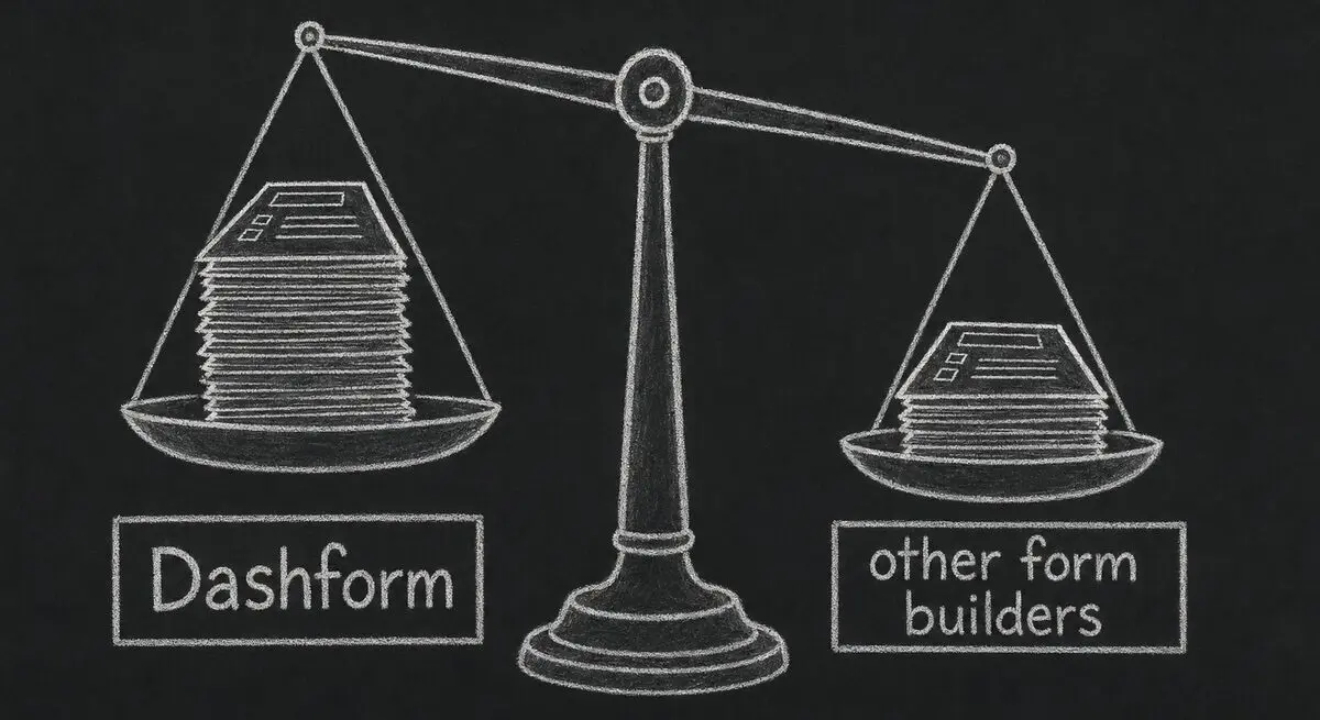
This is exactly where Dashform shines. Its AI-powered forms use intelligent conditional logic that adapts in real-time — asking only the questions that matter based on each visitor's unique responses. No coding required.
Mobile Optimization: Where Multi-Step Forms Dominate
Over 60% of web traffic now comes from mobile devices, and this is where multi-step forms deliver their biggest advantage over single-step alternatives.
Mobile-First Design Principles:
One question per screen eliminates scrolling and keeps focus. Thumb-friendly tap targets (minimum 44x44px) reduce frustration. Appropriate keyboard types — show number pad for phone fields, email keyboard for email fields. Auto-advance on selection keeps momentum — when a user taps a radio button, move to the next step automatically.
Replace dropdowns with radio buttons or segmented controls on mobile. Luke Wroblewski's research found that dropdown menus require multiple taps and obscure available options, making them one of the worst mobile input controls.
Smart defaults reduce friction dramatically: use geolocation for address fields, detect device type for OS-specific options, and pre-fill country codes based on IP detection.
7 Multi-Step Form Mistakes That Kill Conversions
Common Multi-Step Form Mistakes and Fixes
| Mistake | Impact | Fix |
|---|---|---|
| No progress indicator | Users feel lost, abandon early | Add step counter or progress bar |
| Too many fields per step | Defeats the purpose of multi-step | Keep to 2-4 fields per step |
| Asking for contact info first | High friction, immediate abandonment | Move contact fields to Step 3-4 |
| No save/resume capability | Lost data frustrates returning users | Auto-save progress, allow resume |
| Premature validation errors | Error messages before finishing typing | Validate on blur (after field exit), not on keystroke |
| Generic error messages | Users don't know how to fix errors | Specific, actionable error text near the field |
| No back button | Users feel trapped, abandon entirely | Always allow returning to previous steps |
Inline validation deserves special attention. Luke Wroblewski's research with 22 users found that proper inline validation delivered: 22% increase in success rates, 22% decrease in errors, 31% increase in satisfaction, and 42% decrease in completion times.
Real Results: Multi-Step Form Case Studies
Multi-Step Form Conversion Improvements
| Company/Industry | Change Made | Result | Source |
|---|---|---|---|
| Just Eat | One-question-per-page checkout | 2 million extra orders/year | Smashing Magazine |
| Boots.com | Accordion → multi-step flow | Significant conversion increase | Smashing Magazine |
| Andie Swim | Added guided selling quiz | 296% conversion increase, 96X ROI | Digioh |
| Trek Bicycles | Product finder quiz form | 200% conversion increase | Salsify |
| CrazyBulk | AI-powered intake form | 141% conversion increase | Digioh |
| Conversion Fanatics Study | Single-step → multi-step | 59.2% conversion increase | HubSpot |
The pattern is unmistakable: whether it's e-commerce checkout, lead generation, or product recommendations, breaking the experience into steps dramatically improves outcomes.
Your Multi-Step Form Checklist
Use this checklist to audit your existing forms or build new ones:
Multi-Step Form Implementation Checklist
| Category | Requirement | Priority |
|---|---|---|
| Structure | 2-4 fields per step maximum | Critical |
| Structure | Easy questions first, contact info last | Critical |
| Structure | Logical grouping of related fields | High |
| UX | Clear progress indicator visible at all times | Critical |
| UX | Back button on every step | Critical |
| UX | Inline validation on field blur | High |
| UX | Auto-save progress between steps | Medium |
| Mobile | One question per screen on mobile | Critical |
| Mobile | Thumb-friendly tap targets (44px+) | High |
| Mobile | Appropriate keyboard types for each field | High |
| Logic | Conditional logic to skip irrelevant questions | High |
| Logic | Smart defaults and pre-fill where possible | Medium |
| Analytics | Track completion rate per step | High |
| Analytics | Identify drop-off points for optimization | High |
Get Started: Build Your First Multi-Step Form
Dashform makes building high-converting multi-step forms effortless — no coding required. Here's how to get started:
-
Create an AI-Powered Form — Describe what you need in plain language and Dashform's AI builds a multi-step form with smart conditional logic automatically
-
Build a Product Recommendation Quiz — Turn your product catalog into an engaging guided selling experience that qualifies leads as they click
-
Set Up a Consultation Booking Form — Create an intelligent intake form that qualifies prospects and books meetings in a single flow
-
Connect Your CRM — Sync qualified leads directly to HubSpot, Salesforce, Klaviyo, or 100+ other tools via native integrations and webhooks
-
Optimize With Analytics — Track per-step completion rates, identify drop-off points, and A/B test different question orderings to maximize conversions
Frequently Asked Questions
What is a multi-step form?
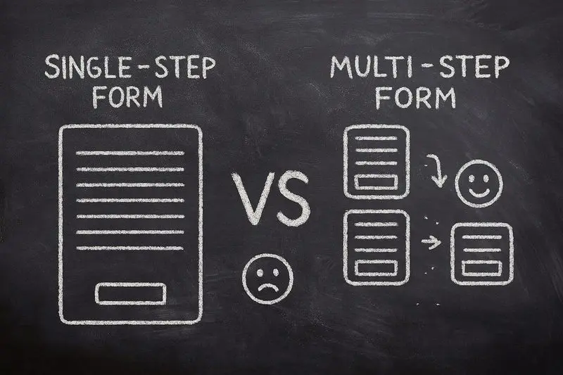
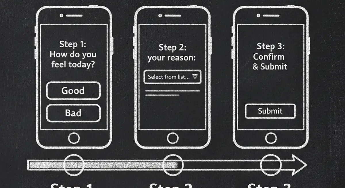
A multi-step form breaks a long form into multiple shorter steps, showing only a few fields at a time. Instead of overwhelming visitors with 10-15 fields on one page, each step presents 2-4 related questions. Users navigate between steps with Next/Back buttons and see a progress indicator showing their position. This approach reduces cognitive load and increases completion rates by 300% on average.
How many steps should a multi-step form have?
The ideal number depends on your form type. Lead capture forms work best with 2-3 steps. Contact and inquiry forms perform well with 3-4 steps. Consultation booking and product recommendation quizzes can go up to 5-7 steps. The key rule: each step should contain 2-4 related fields. If a step has more than 4 fields, split it further.
Do multi-step forms really convert better than single-step forms?
Yes — significantly. Conversion Fanatics found a 59.2% conversion increase from switching to multi-step. Just Eat generated 2 million extra orders per year with one-question-per-page. On average, multi-step forms convert 300% better than single-step forms, with some implementations seeing 5x improvements or more. The psychology is well-documented: reduced cognitive load, commitment consistency, and sunk cost all drive higher completion.
Should I ask for the email address first or last in a multi-step form?
Last — always last (or close to last). Asking for contact information in Step 1 creates immediate friction and high abandonment. Start with easy, low-friction questions (name, what brings you here) to build commitment. By Step 3-4, users have invested enough time that providing their email feels like a small additional step rather than a big ask. This foot-in-the-door technique can increase email capture rates by 40-60%.
What's the best progress indicator for multi-step forms?
The most effective progress indicators show three things: current position (Step 2 of 4), remaining effort (2 steps left), and visual momentum (completed steps look different from remaining ones). A numbered step bar works well for 3-5 steps. For longer forms, a percentage progress bar creates smoother momentum. Research shows users with progress indicators are 3x more willing to continue than those without.
Can I add conditional logic to multi-step forms?
Absolutely — and you should. Conditional logic dynamically adjusts which questions appear based on previous answers, skipping irrelevant steps. This reduces form length by 20-40% for each user while collecting more relevant data. Dashform's AI-powered forms handle conditional logic automatically, adapting the form flow in real-time based on each visitor's responses.
How do I track multi-step form performance?
Track completion rate per step, not just overall conversion. This reveals exactly where users drop off. If Step 3 has a 50% drop-off rate, the questions in that step need reworking. Also track time per step (too long suggests confusion), back-button usage (suggests unclear questions), and field-level error rates. A/B test different question orderings and step groupings to continuously optimize.
Key Takeaways
Multi-step forms convert 300% better than single-step forms on average, with some implementations seeing 5x or higher improvements
The psychology works because multi-step forms reduce cognitive load, trigger commitment and consistency, and leverage the sunk cost effect
Question order matters — start easy, escalate gradually, and save contact information for later steps when commitment is highest
Conditional logic is the conversion multiplier — AI-powered forms that adapt questions based on responses outperform static multi-step forms by an additional 35-60%
Mobile optimization is non-negotiable — one question per screen, thumb-friendly buttons, and appropriate keyboards are table stakes in 2026
The data is clear: if your forms still show all fields on one page, you're leaving 60-75% of your potential leads on the table.
Try Dashform free and see the difference multi-step forms make.