Every comparison page on this site — Typeform, Tally, Jotform, Google Forms, every "vs Dashform" page — leans on the same internal rubric. We've never published it before, which made our comparisons feel exactly like the unsourced feature matrices you find in 90% of "best form builder" listicles. This post is that rubric. If a Dashform comparison page makes a claim about a competitor, this is the methodology behind it.
Our goal here is not to convince you Dashform always wins. (It doesn't, and that's documented below.) It's to make our judgments testable: the criteria, the weights, the tools we excluded, the things we deliberately don't measure.
The eight criteria and their weights
| # | Criterion | Weight | What it actually measures |
|---|---|---|---|
| 1 | Setup speed for a non-technical user | 14 | Time from first login to a live, response-accepting form URL. Capped at 60 minutes; tools above that get a flat zero. |
| 2 | AI-generation quality | 14 | Same five-line prompt across every tool. Graded on qualifying questions, scoring/routing, and how much manual cleanup the output requires. |
| 3 | Conversion-friendly UX | 12 | One-question-per-screen, mobile rendering, save-and-resume, autoprogress, error states. Benchmarked against a 6-question quiz at 1,000 sessions. |
| 4 | Lead qualification depth | 12 | Real scoring engine (numeric, branching, weighted) vs. conditional show/hide. Score-band routing and dashboard visibility count. |
| 5 | Integrations breadth + depth | 10 | Native vendor-owned integrations score higher than Zapier-only. Tested against Google Sheets, Notion, and a CRM. |
| 6 | Pricing fairness on the entry tier | 10 | Free or cheapest paid plan is graded on response cap, branding, integration limits, and add-on paywalls. |
| 7 | Data export & ownership | 7 | CSV/JSON export without contacting support, API rate limits, data retention after cancellation. |
| 8 | AI-agent readiness | 5 | Machine-readable interface (MCP server, public API, structured form schema) so a third-party agent can submit a response on a respondent's behalf. |
| — | Total | 84 | Headroom left so we can add criteria without rebalancing every score. |
What this rubric is for
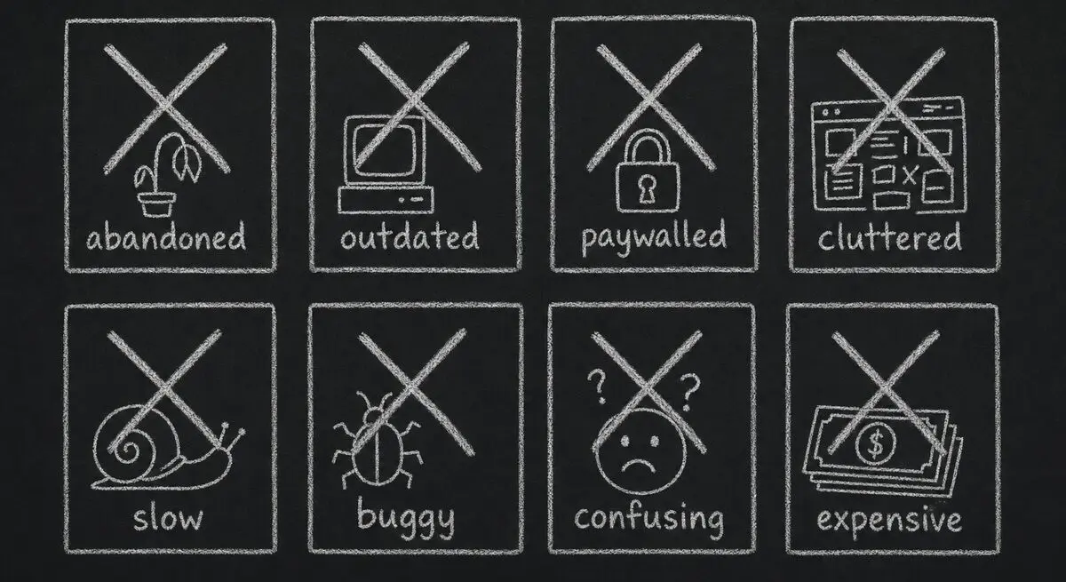
Most "best of" content in our category is written from one of two places: an affiliate publisher who hasn't actually used most of the tools they're ranking, or a vendor's marketing team who scored their own product 10/10 and everyone else 4/10. Neither produces useful comparisons.
We built and run a real form-funnel platform. We have to compete every day on the things our customers actually evaluate — speed of setup, conversion rate, qualification quality, integrations, pricing pressure on small teams. So when we publish a comparison, we're publishing the exact framework we'd want a buyer to use to evaluate us — applied to a competitor.
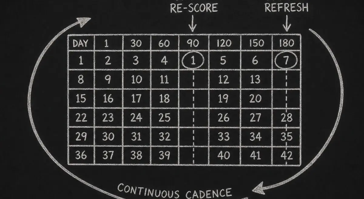
The rubric in this post is the one we apply to every tool we feature in /compare. We update the scores quarterly as features ship and prices change.
The eight criteria, in narrative form
The total weight is intentionally not 100 — we want to be able to add criteria over time without rebalancing every score. The current weights add to 84, which leaves headroom for two or three more criteria to land at 5–8 points each.
Setup speed (14 points). We measure time-to-first-published-funnel from "logged in for the first time" to "form URL is live and accepting responses." Capped at 60 minutes; tools that take longer than that get a flat zero on this criterion. This is the single criterion most likely to surprise reviewers — drag-and-drop tools often look fast in demos and slow in practice.
AI-generation quality (14 points). We give each tool the same five-line prompt — "a lead-qualification quiz for a SaaS product targeting marketing agencies" — and grade the output on whether it asked qualifying questions, whether it scored or routed the lead, and how much manual cleanup it required. Manual cleanup is the dominant factor: most tools generate a passable shell and then leave you to wire it up yourself.
Conversion-friendly UX (12 points). One-question-per-screen vs. wall-of-form, mobile rendering, save-and-resume, autoprogress on choice questions, error messaging. Scored against a benchmark conversion rate for a 6-question quiz funnel at 1,000 sessions.
Lead qualification depth (12 points). Is there a real scoring engine — numeric, branching, weighted — or just conditional show/hide? Can a respondent be routed to different end screens by score band? Is the score visible in the dashboard and sent to integrations? Tools that only support conditional logic without scoring get half credit here.
Integrations breadth + depth (10 points). Native (built-in, owned by the vendor) vs. Zapier-only. Native scores higher because it survives Zapier outages and doesn't add a per-zap cost. We test three representative destinations: Google Sheets, Notion, and a CRM (HubSpot or Salesforce).
Pricing fairness on the entry tier (10 points). We grade the free or cheapest paid plan: response cap, branding, integration limits, removal of add-on paywalls. Tools that lock the entire conversion path behind the highest tier — webhooks at $99/mo+ is the canonical case — get penalised here, even when their headline price looks competitive.
Data export and ownership (7 points). Can you get every response out as CSV or JSON without contacting support? Are there hard rate limits on the API? Does cancelling delete your data immediately or does it stay accessible for 30+ days?
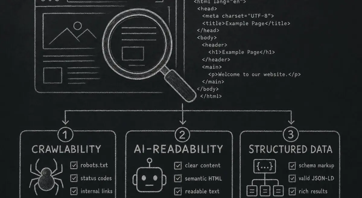
AI-agent readiness (5 points). Newest criterion, added April 2026. Does the tool expose a machine-readable interface — MCP server, public API, structured form schema — so a third-party AI agent can submit a response on a respondent's behalf? Most tools score zero here today. That's a real signal of where the category is going, not just our positioning. If you're curious how your own funnel would score on this dimension, our AX Audit is a free starting point.
A perfect total is 84. A score of 60 is "competent and worth recommending for the right use case." Below 40 we generally don't write a comparison page at all — there's nothing useful to say.
What we exclude, and why
We started this rubric with twenty-two tools. Eight of them were cut before we wrote a single comparison page. The reasons:
Three were no longer maintained. Two had stopped shipping updates more than 12 months ago — their last changelog entry was older than our oldest comparison page would be on publish day. The third had a public roadmap that hadn't moved in 18 months. Comparing live tools to tools that may not exist in a year is the kind of thing that makes "best of" lists age into junk.
Two were enterprise-only with no self-serve tier. They might be the right answer for a Fortune 500 procurement team, but the audience reading our /compare pages is small and mid-sized teams running a credit card and a Tuesday afternoon. Tools you can't try without a sales call belong in a different roundup than ours.
Two were Google Forms wrappers. They added theming or a few branching rules on top of Forms but inherited every Forms limitation. Comparing them as separate products felt dishonest.
One was a survey-only tool. It refused to support lead capture, scoring, or routing. Our audience cares about all three. A great survey tool we'd happily recommend for surveys, but a comparison would have been apples to oranges.
If your favourite tool isn't on our /compare list, it's most likely one of those four reasons.
What we deliberately don't score
Three things show up in other comparison sites that we've decided not to weight, and we want to be specific about why:
Number of templates. Templates rot fast and most are decorative. A tool with 800 stale templates ranks higher on listicle counts than one with 30 well-maintained ones, and that's the wrong signal. We notice that we ourselves have 700+ templates in our own catalog. We're working on it — see our roadmap.
Customer count and "trusted by Fortune 500 logos." Half of those logos are sales-team relationships; the other half are an intern's free-tier account from three years ago. Logos don't tell you whether a tool will work for your specific funnel, and we've stopped asking about them.
Star ratings on review sites. G2, Capterra, and the rest are gameable. We read every review on our own G2 listing — none of them are wrong, exactly, but the aggregate score moves around based on incentives we can't see. We treat ratings as one informal signal, not a scored criterion.
If something is wrong with how we're handling any of those, tell us — feedback@dashform.com. We've changed methodology before based on customer pushback.
How we score each tool
For each tool we review:
First, we sign up for the free tier on a fresh account, or the cheapest paid tier when no free option exists. Second, we try to ship the same reference funnel — a 6-question lead qualification quiz with scoring, an end-screen variant per score band, and a Google Sheets sync — on every platform. Third, we time the setup, collect screenshots, export the data, and cancel the account. Fourth, we score the eight criteria above; two reviewers score independently, and if their totals differ by more than 8 points we re-test together. Fifth, we publish only if the resulting page would actually be useful.
Each comparison page on this site carries a dateModified reflecting the most recent re-score. We aim for a 90-day refresh on the four most-trafficked competitor pages and a 180-day refresh on the rest. If the modified date on a page is older than 12 months when you read it, treat the specifics as out-of-date — we'll have updated by then or pulled the page.
Where we lose
Dashform doesn't beat every tool on every criterion. The honest version:
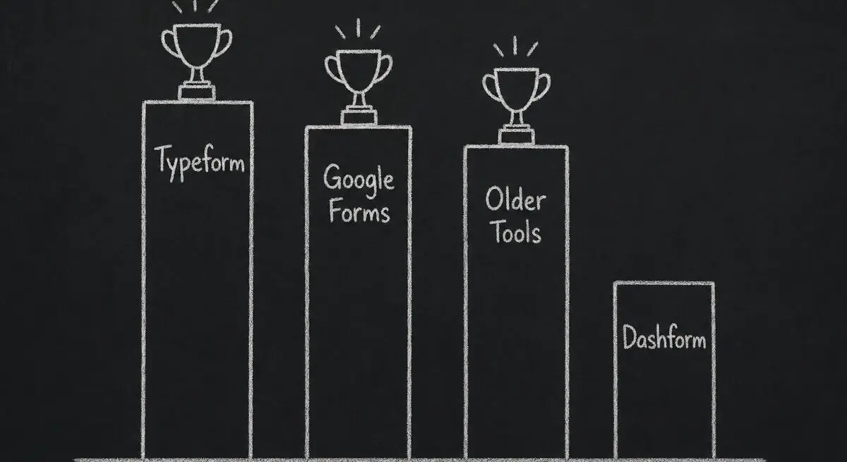
We lose on theme depth to Typeform. Typeform's design system and motion polish are still the gold standard in the category. We picked a different bar — conversion utility over visual maximalism — but if visual polish is your top criterion, Typeform is the right tool.
We lose on raw price to Google Forms. Google Forms is free in a way we're not; we can't beat zero. We're a different product (qualification + AI generation + agent-ready integrations), but if free is the constraint, Forms is the answer.
We're newer to enterprise. Tools that have been around since 2015 have a 10-year head start on SOC 2 polish, EU data residency, and audit trails. Our enterprise story is solid for mid-market and getting better — but we're transparent about not being the most mature option for a regulated Fortune 100 buyer in 2026.
Each /compare/[competitor]-alternative page has a "Where they win" section that's specific to the tool. We'd rather lead with that than pretend we beat everyone on everything.
Cadence and updates
We re-score in batches. The next scheduled batch is August 2026. We'll edit this post when criteria change, and we'll list the change at the top so returning readers can see what moved.
Things on the roadmap for the next iteration:
Adding a post-purchase retention signal to AI-generation quality — generators that produce one-shot output and can't refine after the funnel is live should score lower.
Splitting AI-agent readiness into discoverability (can an agent find this tool?) and submission (can an agent fill it on behalf of a user?). Right now we're scoring both as one thing and it's getting harder to tell apart.
Cutting template count entirely from any narrative section, even informal mentions. We've noticed it sneak back into conversational copy and we want it gone.
If you want to suggest a criterion or a tool we should look at — or if you've found a comparison page where the methodology is misapplied — please email us at feedback@dashform.com. We track every comment we get on this rubric.
Frequently Asked Questions
Why does the total weight equal 84 instead of 100?
So we can add new criteria over time without rebalancing every existing tool's score. AI-agent readiness was added in April 2026 as a 5-point criterion; if we'd started at 100, we'd have had to retroactively re-score every tool to make room for it. Leaving headroom is cheaper than running a full re-evaluation every time the category shifts.
How often are scores updated?
We aim for a 90-day re-score on the four most-trafficked competitor pages and a 180-day refresh on the rest. The dateModified timestamp on each comparison page is the source of truth. If a page hasn't been re-scored in 12+ months, treat the specifics as stale.
Why don't you score template count?
Template count is a vanity metric. A tool with 800 decorative templates does worse work than one with 30 maintained ones, but it ranks higher on every listicle that counts templates. We score how the tool performs on a real reference funnel, not how many templates it ships with.
Are reviewers compensated by the tools they evaluate?
No. We don't run affiliate links on /compare pages, we don't accept payment from the tools we evaluate, and we don't take demo briefings as part of scoring. We sign up at the free or cheapest paid tier on a fresh account, run the reference funnel, and cancel.
What if my tool was excluded — can it be added back?
Email feedback@dashform.com with the tool name and what changed since exclusion. The most common readmission case is a tool that was on our "unmaintained" list shipping a meaningful release. We re-evaluate quarterly.
Can I see the raw scores for a specific tool?
Yes — every /compare/[competitor] page shows the full eight-criterion breakdown with the same weights as this post. The page also lists what changed since the last re-score, so you can tell whether the tool moved on a specific criterion or whether the methodology shifted underneath it.
How is this different from G2 or Capterra?
G2 and Capterra aggregate user reviews. We run a single reviewer team against a single reference funnel, so the variance is from the tools, not from which user wrote the review. The two approaches answer different questions: aggregate ratings tell you what the average user feels; methodology like ours tells you how the tool performs on a specific job-to-be-done.
What about new tools that launched in 2026?
We add new tools to the evaluation set when they cross two thresholds: (a) they're maintained — at least one shipping release in the last 90 days; and (b) they have enough conversion-funnel surface area that a meaningful comparison is possible. Tools that meet both bars but score below 40 still don't get a comparison page, because there's nothing useful to say.
Conclusion
If a Dashform comparison page makes a claim, this rubric is the receipt. Eight criteria, transparent weights, the exclusions, the things we don't score, and the cases where competitors beat us. We'd rather you read this and then read the comparison than the other way around. If you want a starting point for evaluating your own funnel against this rubric, our AX Audit runs the same checks against any public form URL — free, no account required.