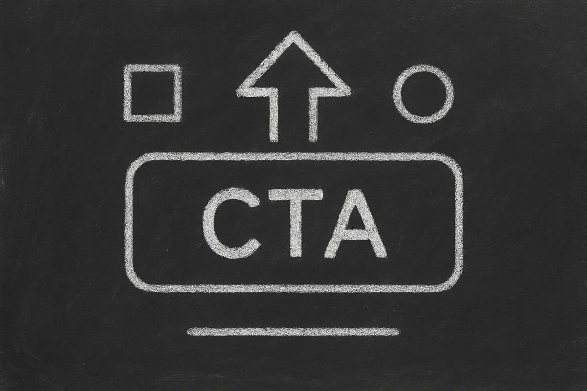
Your call-to-action (CTA) button is the most critical element on any landing page, form, or email. It's the final push that transforms interest into action — or watches potential leads bounce away. Yet most businesses treat CTAs as an afterthought, using generic buttons like 'Submit' or 'Click Here' that blend into the background. In this comprehensive guide, we'll explore proven CTA button strategies, best practices for placement and design, and how modern tools like Dashform help you create high-converting action buttons that drive results.
Why CTA Buttons Matter More Than Ever
Research shows that optimized CTA buttons can increase conversion rates by 28% or more. With average attention spans under 8 seconds, your button has one job: make users click.
- First impression of your value proposition
- Decides whether leads convert or leave
- Single biggest lever for conversion optimization
- Reinforces brand personality and professionalism
CTA Impact on Conversions
| Button Style | Generic | Specific + Action-Oriented | Improvement |
|---|---|---|---|
| Click Rate | 1.5% | 3.8% | 153% |
| Form Completion | 45% | 72% | 60% |
| Time to Decision | 4.2 seconds | 2.1 seconds | 50% faster |
Elements of a High-Converting CTA Button
1. Action-Oriented Language
- Use verbs that drive action: Get, Download, Start, Book, Get Your, Claim
- Be specific about what they'll get
- Create urgency without being pushy
2. Visual Design Principles
- Contrasting color that stands out from background
- Adequate size (large enough to tap on mobile)
- Whitespace around the button
- Clear, readable font
3. Strategic Placement
- Above the fold for main CTA
- Multiple CTAs for long pages
- At natural pause points in content
- End of each section with a relevant CTA
4. Value Proposition
- Tell users exactly what they'll get
- Use words that create desire
- Address the user's primary motivation
100 Call-to-Action Button Examples That Convert
Lead Generation Forms
- Get Your Free Quote
- Download My Free Guide
- Claim Your Free Trial
- Get Your Personalized Plan
- Start Your Free Consultation
- Get Instant Access
- Download Your Custom Report
- Get Your Free Assessment
E-commerce
- Add to Cart
- Buy Now & Save 20%
- Get Yours Today
- Shop the Collection
- Claim Your Discount
- Get Free Shipping
- Start Your Trial
- Build Your Bundle
Services & Consulting
- Book Your Free Call
- Schedule Your Consultation
- Get Your Proposal
- Start Your Project
- Claim Your Free Audit
- Get Your Custom Quote
- Schedule Demo
- Talk to an Expert
Content & Downloads
- Download the Ebook
- Get the Checklist
- Download Your Template
- Watch the Webinar
- Get the Guide
- Download the Worksheet
- Get Your Free Course
- Access the Toolkit
SaaS & Digital Products
- Start Free Trial
- Get Started for Free
- Start Building
- Try for Free
- Start Your Project
- Get Early Access
- Join the Beta
- Start Using Free
CTA Best Practices by Channel
Landing Pages
- One primary CTA above the fold
- Secondary CTAs for different audiences
- Sticky CTA for long pages
- Match CTA to landing page offer
Forms
Form CTAs should be the last element users see before submitting.
- Use action-specific language on forms
- Consider multiple CTAs for different user types
- Test button text against your audience
- Make the submit button compelling, not generic
Emails
- One clear CTA per email
- Above the fold on desktop, top of email on mobile
- Use buttons, not text links
- Test timing for automated sequences
Social Media
- Match platform conventions
- Use platform-specific button options
- Create urgency when appropriate
- Test variations for each platform
How to Test and Optimize Your CTAs
A/B Testing Framework
CTA A/B Testing Guide
| Element | Test Ideas | What to Measure |
|---|---|---|
| Button Text | Action vs Benefit | Click-through rate |
| Button Color | Complementary vs High Contrast | Visual attention |
| Button Size | Small vs Large | Mobile vs Desktop |
| Placement | Above vs Below fold | Time to conversion |
| Copy Length | Short vs Long | Clarity vs Detail |
Common CTA Mistakes to Avoid
- Generic submit buttons instead of specific actions
- Too many CTAs creating choice paralysis
- CTAs that don't match the offer
- Buttons that blend into the design
- No sense of urgency or value
- Ignoring mobile users
Optimization Process
- Start with baseline metrics
- Test one element at a time
- Wait for statistical significance
- Implement winner and repeat
- Document learnings for future campaigns
CTA Buttons in Interactive Forms
Interactive forms and quizzes require special CTA considerations.
- Progress indicators that encourage completion
- Contextual CTAs based on answers
- Results-gated final CTAs
- Multiple entry points for different funnels
How Dashform Helps Create Better CTAs
Dashform provides built-in CTA optimization features:
- Smart Button Text - AI suggests action-oriented CTA copy based on your form type.
- Conditional CTAs - Show different buttons based on user answers for personalized follow-up.
- Conversion-Optimized Templates - Pre-built forms with proven CTA patterns.
- A/B Testing - Test different CTA variations to optimize conversions.
Frequently Asked Questions
What makes a good CTA button?
A good CTA button uses action-oriented language that clearly tells users what will happen next. It stands out visually through contrasting colors and adequate size. The button should create a sense of urgency or clearly communicate the value users will receive by clicking.
Where should I place my CTA button?
Place your primary CTA above the fold where it's immediately visible. For longer pages, include CTAs at natural break points and at the end. For forms, the submit button should be the final element after all inputs are completed.
How do I write compelling CTA copy?
Start with strong action verbs (Get, Download, Start, Book). Be specific about the outcome. Create urgency without being pushy. Test different variations to see what resonates with your audience. Example: Instead of 'Submit', use 'Get My Free Quote'.
Should I use multiple CTAs on one page?
Limit to one primary CTA to avoid choice paralysis. For different audience segments, you can have secondary CTAs, but ensure the primary action is clearly dominant. Match each CTA to a specific user journey or offer.
How do mobile CTAs differ from desktop?
Mobile CTAs need larger touch targets (minimum 44x44 pixels). Place primary CTAs where thumbs naturally rest. Consider sticky CTAs that remain visible while scrolling. Ensure buttons are easily tappable without accidental clicks.
How often should I test my CTAs?
Run continuous A/B tests, changing one element at a time. Test new variations whenever you launch new campaigns or pages. Review performance monthly and implement winners. Treat CTA optimization as an ongoing process, not a one-time task.
Conclusion: Make Every Click Count
Your CTA button is the gateway to conversion. Every visitor who sees it makes an instant decision: click or leave. By using specific, action-oriented language, strategic placement, and continuous testing, you can dramatically improve your conversion rates.
Start optimizing your CTAs today. Try Dashform — build conversion-optimized forms with AI-powered CTA suggestions that turn more visitors into leads.